Dark themed graphical user interfaces have been a hot topic of late, especially since late 2019 when Apple introduced dark mode to macOS Catalina, to iOS and iPadOS with iOS 13 and Google to Android 10. Because mobile devices are exactly what their name describes, mobile, it means they can be used in all sorts of different physical contexts, which makes the question of dark modes in mobile app, especially pertinent.
At Rootstrap, we’ve had a multitude of discussions, internal and with clients, around the real value dark themes offer or don’t. There’s no real simple answer other than “it depends.” Before dismissing dark themes and simply a fad or gimmick, we’d like to present some of the different ways we’ve been thinking about and approaching the matter.
History of Dark Modes
Dark interfaces are, in fact, nothing new; the first GUIs rendered on CRT monitors were inherently dark because of the characteristics of the screen technology itself.
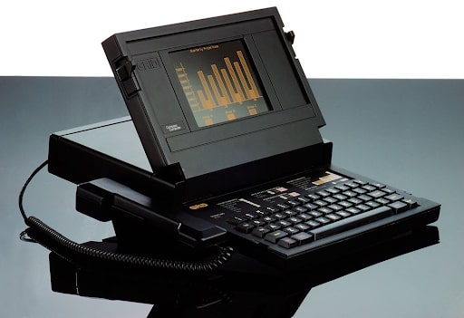
The GRiD Compass, widely regarded as the first laptop, had a plasma monochrome amber-black dark display that GRiD claimed could be “viewed from any angle and under any lighting conditions.”
The switch to dark elements on a light background, or light themes, for consumer software was made to emulate more closely text on paper — an information medium people, at that time, were most familiar with. However, 40 odd years have passed, and I’d hazard a guess that most of the world’s population has grown up spending more time interacting with screens than with paper, which kind of turns this original premise on its head.
Today – Dark Modes in Mobile App
Today, in the world of mobile apps, we’re seeing a trend away from doing overtly customized app (visual) interfaces for the sake of doing overtly customized interfaces, which was maybe more prevalent five to ten years ago. We also see the lines being blurred between a pure “in-app” experience and the Operating System experience as the big mobile OS’s (iOS and Android) have opened up more and more to developers (and in turn users) with new APIs and integrations (Think Siri Integrations, Homekit, Shortcuts and more recently, Widgets on iOS).
Dark modes in mobile app is similar in the way that the interface adheres to a higher level user preference that goes above any stylistic preferences an app creator might have for their app. There can still be room for customization and creativity when and where it makes sense. When we consider a user who can jump back and forward, multitasking across a range of apps, with dark mode enabled at a system level, and if one of these apps did not support dark mode, the experience can undoubtedly be jarring.
Fad or scientifically proven?
With hype comes healthy skepticism, and dark mode is no exception. There’s no shortage of arguments on either side of the fence arguing what is, in fact, more healthy (for sight), legible or usable, dark or light, and this article will not endeavor to pronounce any scientific or pseudo-scientific claims on the matter. What’s important to be mindful of is that there are so many variables at play; the physical context the user is in, the screen technology, the type of content that’s being displayed, the user’s vision, what they’re already used to, and, perhaps most importantly, what their own personal preference is.
A user’s choice for dark modes in mobile app
This isn’t about us as app designers imposing onto the user what we deem best for them; it’s about letting users be in control and deciding what they think works best for them.
Take for example iOS 14, which seemingly unexpectedly (on Apple’s part), opened up the possibility to users to customize any app icon on their home screen. We now see in the iOS 14.3 Beta 2 update that Apple has effectively embraced (or conceded?) to this by no longer routing the custom icons through the Shortcuts app, which greatly improves the user experience for those 15% of iPhone users who’re dabbling in home screen customization. Rather than enforcing restrictions on iOS users, in this instance, Apple reacted positively to the unintended customization hype and made the experience even better for those who’re customizing.
The same goes for the similarly related and perhaps equally divisive NightShift feature on Apple platforms — whether there is or isn’t a scientific proof that exposure to blue light affects our serotonin levels, if some users like using it, the option is there for them. It’s about Customization as a UX principle.
A system may enable users to customize or make changes to the experience to meet their specific needs.
Nielson Norman Group
Who understands a user’s unique needs better than the user themself? If your product already has users, learn more about them: are they using dark mode already with other applications or on other platforms?
User Motivations
The when and how a user uses dark modes in mobile app can vary as much as the motivations they have for doing so. While some people set (to light or dark) and forget, others may toggle back and forth manually while others choose to let the system switch automatically based on the time of day.
A user’s reasons for using or not using dark modes at certain times can come down to things like the perceived ease of use, personal aesthetic preferences, or even to reduce battery consumption (especially relevant on OLED displays).
Just like the now common practice of silencing the interaction sounds on our devices when in social settings in order to reduce noise pollution (and prevent unwanted glares), the conscious use of dark mode in low light social settings in order to reduce light pollution is an emerging practice allowed by this technology. Just think of an intimate concert, overnight transport, a movie theatre; the light emitted from a light vs. dark theme is palpable. Whether it’s some sort of virtue signalling or common courtesy, there are people who’re conscious and sensitive to these things, and this will undoubtedly be a continuing trend.
Users are often more technologically articulate than they’re sometimes given credit for.
Should you even use light mode?
We presented the case for considering dark mode, but also consider whether you should even have a “light mode.” Because the lines get blurry between brand experience and user experience, consider how different themes can affect your brand.
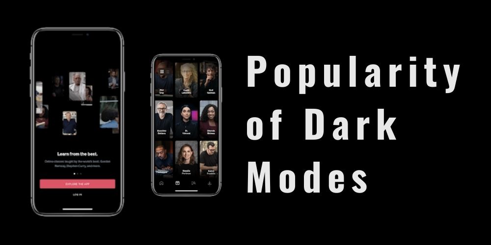
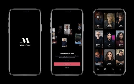
For MasterClass, the answer, for the time being, has been no. When we consider the types of physical contexts the product is used in, it makes sense. Also, considering that certain types of content appear bolder and richer in dark interfaces and that this is a premium product, Master Class is particularly apt for a dark themed only interface. Arguably, a light mode could potentially detract from the premium, top-shelf content appeal that MasterClass has so successfully cultivated.
Similar rationales can be made for Spotify and Netflix — other products that are essentially dark mode only, and the interfaces of these products are such a strong part of their respective brands.
If your product functions more like a utility or tool for your users, you’re much more likely to want to support a dark mode to let them be as comfortable as possible using interacting with the application. Here, the interface should concede protagonism to the task the user is trying to achieve, not the other way around.
Tips to use dark modes in mobile app
If you’ve decided that you’re going to implement dark mode in your mobile application, we’ve put together some key bits of advice.
1. Don’t simply invert colors
A color’s appearance is affected by the context it appears in. Colors can appear more saturated on a dark background than a light one, which means you should consider having a slightly desaturated version of your light theme palette for your dark theme.
Colors present themselves in a continuous flux, constantly related to changing neighbors and changing conditions.
Josef Albers, The Interaction of Color
Furthermore, it’s important to be careful with too harsher contrasts between elements and the background they’re rendered on, particularly with typography. 100% white text on a 100% white background can be overly harsh on the eye and can appear to visually vibrate, severely degrading legibility.
2. Read the platform documentation
Study up on Apple’s Human Interface Guidelines and Google’s Material Design guidelines regarding dark mode. Watch Apple’s “Introducing Dark Mode” WWDC session.
3. Be mindful of accessibility
In so many ways, the dark mode can be thought of as an accessibility feature. Ensure your design meets a11y requirements.
4. Design systematically
The goal should be to achieve appropriate continuity across modes. This can be achieved through a systematic approach to design. Whether or not you’re already working with or will create a fully-fledged design system, being organized in the way you approach the design can translate into a harmonious experience for the end-user.
As we mentioned earlier, some users switch back and forth between modes; it’s important that users can orient themselves easily in either mode.
Conclusion
With any potential feature or development effort, it’s always worth considering cost and effort vs. impact, and the same applied to dark mode. While many users are expecting dark mode to be available if you’re a startup that’s looking to establish product/market fit, adding dark mode support isn’t what’s going to get you there. Once you do get there, the option to support dark and light themes could likely be something that your users expect, and if a competitor offers it and you don’t, then this could be a reason enough for them to abandon your product.
Like responsive web design or even cross-browser approaches, both had to gain their places in the design and development workflows, which takes time. Nowadays, they are considered fundamentals in producing good user experiences on the web. In a few years from now, dark mode support will likely be considered a fundamental component to creating most any digital product with a visual, screen-based interface.

Joseph Pearce
Joseph Pearce is a Senior Product Designer at Rootstrap, a custom software development agency that helps companies like Google, MasterClass, and Quartz scale people, processes, and products.