Typography is an essential element of app design, enabling comprehensibility and user experience. This complete guide on mobile app typography covers fonts, contrast, hierarchies, and whitespace. It will give you the skills to build beautiful and legible apps in no time.

The rapid development of mobile technology has meant that these items are now inextricably linked to our daily lives and the tasks therein. The average person now spends upwards of three hours a day interacting with mobile devices, making the mobile app market a lucrative opportunity for developers.
However, there are challenges in developing mobile technology, and designing apps for smaller screens takes care and caution. Typography impacts heavily on user experience, and on mobile devices, with limited space, this takes on increased importance. Read on for everything you need to know about designing better mobile app typography.
Why Mobile App Typography Matters
Typography is an essential element of design in all settings, but on mobile devices, it becomes amplified in importance as smaller screens provide less margin for typographical error.
Whilst 4G has enabled video to become a prevalent way of communicating information in mobile apps, the text is still essential for the usability of any app, and typography can make or break the user experience.
“Good typography can provide an app with a professional sheen, increasing users’ trust in an app,” says Trina Smith, a journalist at Draft beyond and Research papers UK.
“Further, with good mobile typography, legibility is increased, and users will be encouraged to spend time in your app.” Typography cannot be overlooked in app design, so let’s take a look at how to optimize your typography for a better mobile app.
The Limits Of Font Size
Font size is essential for the legibility of information on a phone screen, and some essential behavioural elements impact the upper and lower limits for font sizes. Mobile users are often on the go, and thus information needs to be provided at-a-glance in mobile apps.
Screen glare and external distractions are also often prevalent, meaning that if fonts are too small mobile users will be limited in how they can use a mobile app.
When designing apps for Android or iOS, Google and Apple respectively offer guidance for minimum font sizes. In their Human Interface Guide, Apple suggests that the minimum font size is set at 17pt, whilst Google recommends that body text is set at a minimum of 16sp (‘pt’ and ‘sp’ are the relevant metrics used in font size by Apple and Google, but they are roughly comparable).
Users may have preferences about Font size and can adjust them in the settings of their mobile devices. Apps should be able to respond dynamically to these requests – when designing for iOS, for example, enable Dynamic Type Sizes to give users control.
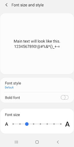
Tip: When designing the typography for an app, these minimum font sizes don’t need to be a hard and fast rule – but ensure that any captions below the minimum sizes are not essential for the user’s comprehension.
Using Delicate Contrast
Contrast is an essential tool of design and can be used to promote comprehension and legibility of text on the page. In short, contrast refers to the ratio between the shades of your text and the background on which it is placed – if these are too similar, your text will be hard to decipher.
Contrast is especially important to consider on mobile devices where screen size and ambient light can make a big difference to the display – by increasing the contrast between background and copy text; the user interface can be optimized.
Tip: Ensure there is sufficient contrast when overlaying text on images.
Choosing Fonts
Whether you’re designing for iOS or Android, there is a degree of guidance about font choice for app developers. On iOS, New York and San Francisco fonts are standardized and, thus, are safe choices for UI, whereas Android uses Roboto as its default font.
Whatever you choose, simplicity and minimalism should be the priorities in font selection to ensure comprehensibility. If you’re using multiple fonts as a design choice, stick to two or three to maintain consistency and keep text looking solid.
Baseline
Developing for multiple operating systems creates a minefield of variations in how text and other elements of the interface mingle or overlap. This creates challenges for UI and typography. Developing all margins relative to a baseline can ensure that layout remains consistent across screen sizes and operating systems, meaning that user experience is preserved across devices.
Tip: “Using baseline for all your text elements can be time-consuming as well as costly to develop,” says Irene Chen, a design blogger at Writinity and Gum essays. “Prioritise this approach where accuracy is especially important for your design.”
Margins And Whitespace
When developing for smaller screens such as mobile devices, packing information into a tight space can lead designers to cut margins, and reducing whitespace. However, this is a risky strategy that often compromises the UI. As text gets squeezed in, it becomes harder for users to comprehend.
Whitespace gives users room to breath, so find a balance between text and other elements. Maximize space by partially revealing content at the bottom of the screen – this lets users know they can scroll for more information.
Limiting Levels Of Hierarchy
Hierarchy is used in design to offer users an intuitive, at-a-glance understanding of the value of information across a page. Typography plays an essential role in indicating the hierarchy of content on smaller screens.
Whilst web design typically utilizes three levels of hierarchy; mobile developers should be wary of this as it can make for a messy user interface on a smaller screen. Limit your levels of hierarchy to two, indicated by two sizes or choices of the font when developing for mobile.
Alignment
Alignment refers to the way text is placed on the page, and it can be left, centre, right, or justified (typically, newspaper-style print). When laying out text on mobile apps, the key is to keep users reading, so the way text ends on one line is essential to how readers are drawn to the next.
Left alignment is favored in mobile app development because the ragged right edge draws users’ attention down the page. However, some designers are favoring a mixture of alignment, and for headers and titles, centre-aligned text can be eye-catching.
Functionality
As important as design is, the functionality should never be sacrificed in pursuit of form. Whatever your mobile app is designed to do, it is surely offering users a tool for something in their lives – never lose sight of this function, and build your typography around it, rather than the other way around.
Whether your app is teaching people a language or facilitating them to make a purchase, the text should be built around the app’s functions. Ensure that clickable elements are large enough for users to tap on, text boxes for inputting user details into are large enough to contain all the information needed.

Signing Off
Typography is a vitally important element of design in mobile app development. By making careful considerations about your font choice and size, as well as broader design choices about contrast, margins, and hierarchy, you can create a beautiful and functional app that will keep users coming back.

Ashley Halsey
Ashley Halsey is a professional writer at Lucky assignments Bristol. Ashley grew up on a farm, instilling a lifelong love of animals that she still possesses, and she volunteers most weekends in a local dog shelter.