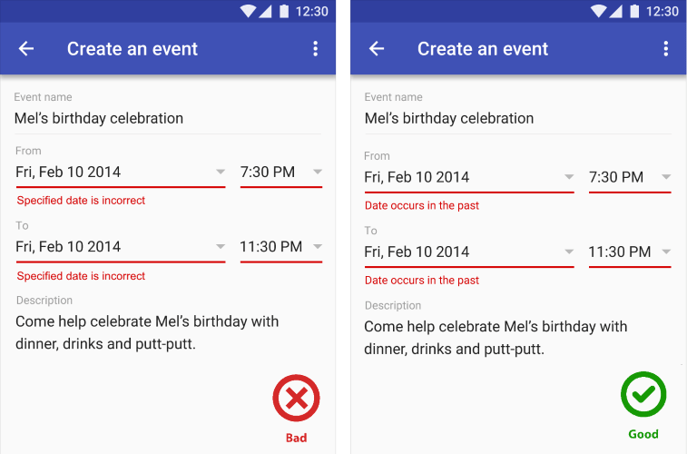
A lot of designers focus on designing cool-looking interfaces and experiences. They A/B test and do user testing to optimize the app to provide the perfect experience. When we’re testing, we don’t often think about what happens when the connection is slow or dropped.
For us designers, a connection failure or slow network is a temporary problem that warrants nothing more than an error message.
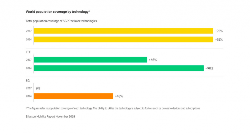
Our offices and homes where we develop apps have awesome WiFi, sure. But what about our users? Even as we transition from from 4G to 5G in 2019, according to the Ericsson Mobility Report, there are still a lot of areas where mobile networks are slow or are simply not available. The real challenge is to build great experiences keeping these users in mind as well as always-on users. If you test your app only in environments where you have fast, reliable internet, you’re missing a reasonable chunk of your user base.
There are plenty of reasons you may not have internet or a slow connection:
- You’re on a flight, and you don’t want to pay for WiFi.
- You’re on a trip in a remote location.
- You can’t afford a data plan for your phone.
- Poor coverage of a provider.
- Extreme weather conditions.
- Traveling on a train and going through a tunnel.
- Internet connection is managed by a third party and time-boxed when it will be active or inactive like in an airport or hotel.

That is why designers should consider network as a variable to the app’s success. It shouldn’t depend on it, but instead design experiences that work around the variable speeds of the network.
88% of online consumers are less likely to return to a site or an app after a bad experience.
So how does offline app design approach create a better user experience? Well, first and foremost, offline design consideration provides consistency that assures users that no matter the situation, the outcome from the app is going to be the same. The anxiety of losing what they were doing is resolved by keeping their work safe.
Besides assurance, application performance also becomes faster because of the offline-first architecture of the app. Most importantly, the app earns users’ trust.
Design Considerations for Slow or Offline States
To provide an uncompromising experience for your users, these are things that you should keep in mind when designing offline experiences for your app.
Use the app’s skeleton to decide what to show to users
An app’s skeleton is the minimal UI framework powering the user interface. This should load fast, be cached and once loaded, dynamic content can populate the app’s view. It’s the secret to reliably good performance.
Skeleton screens actually buy you time to check the connection status. Instead of showing a blank screen, you can give visual feedback to users in the form of a skeleton screen.
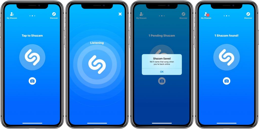
Here is a good example of an app that use Skeletons to decide what to serve users:
Communicate offline status gracefully
Most apps start with an incorrect assumption — that offline is, by default, an error state and they stop users from doing anything. Instead, we should think from user’s point of view and allow them to finish their goals.
So, the best way to handle offline status is not to give errors and in fact guide users on what they can do and cannot do.
[[Here are few tips on how to effectively communicate offline status:]]
Don’t confuse users. Let simple, concise language be their guide
We see that many apps still give error messages that are incomprehensible to savviest of tech users. Good UX design is not just about a well-designed interface. It includes the flow a user takes as well as the language used in the app.
Avoid using technical jargon when explaining the state of the app or individual UI components. Consider that the phrase “app offline” might not convey to the user the current state of the app.
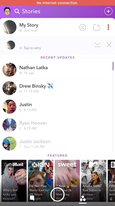
Don’t get in the user’s way, instead gently notify them
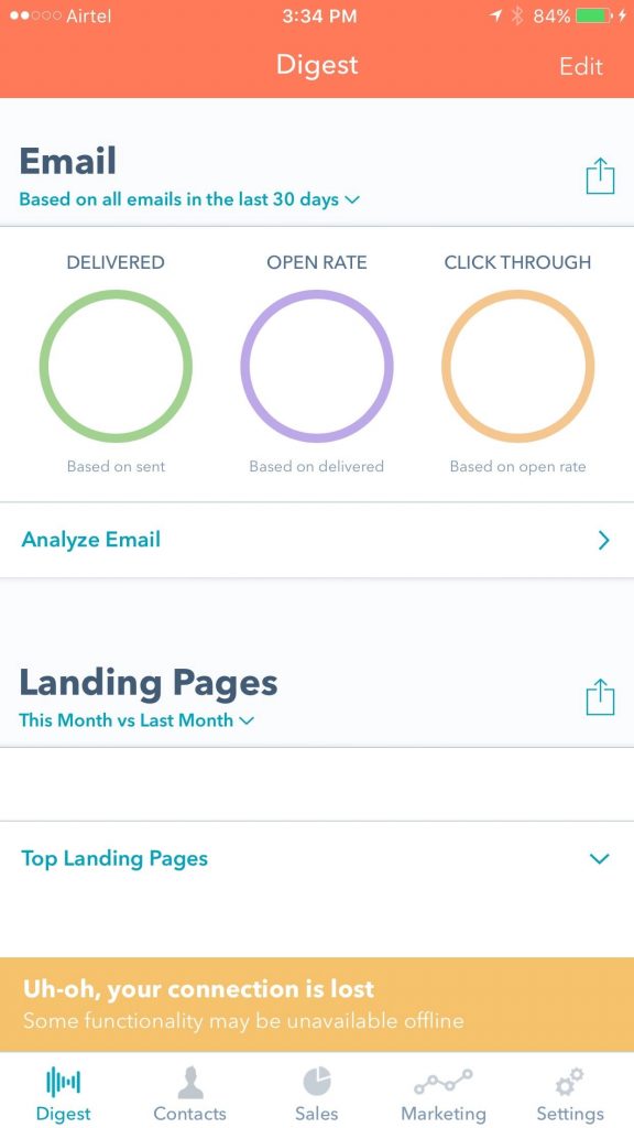
For this to work you have to design the app with offline caching in mind. Then the connection state can easily be maintained by a small bar like examples below. This way, you don’t get in the user’s way and still let them know about the current state.

Smartly handle sync status and conflicting versions
If your app offers collaborative editing or some other form of simultaneous use on multiple devices, you will likely create conflicting versions of objects at some point. We can’t prevent this, but we can provide easily usable conflict resolution UIs for people who might not understand what a sync conflict is.
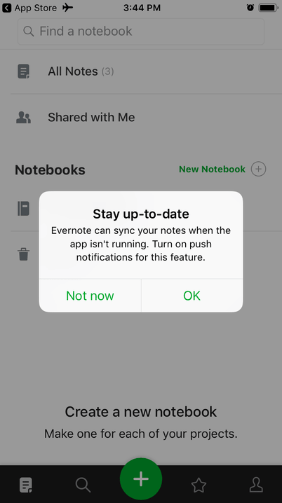
Let’s look at Evernote, whose business is heavily based on syncing notes. Conflicts are resolved by simply concatenating both versions of the note. On anything longer than a couple of lines, this requires an inordinate amount of cognitive effort and subsequent editing.
Draft, on the other hand, has managed to make conflict resolution between collaborators simple and beautiful. It shows both versions and their differences in three separate columns, and each difference has an “accept” and an “ignore” button. Intuitive and visually appealing conflict resolution, at least for text, is definitely possible.
You can also manage current status of an app quickly like Wunderlist.
Provide full-screen notifications for apps that must have internet access
When your app is one of those rare cases that ABSOLUTELY MUST use the internet, you can use notifications like these. However, remember that not all of these apps are those kinds of apps.
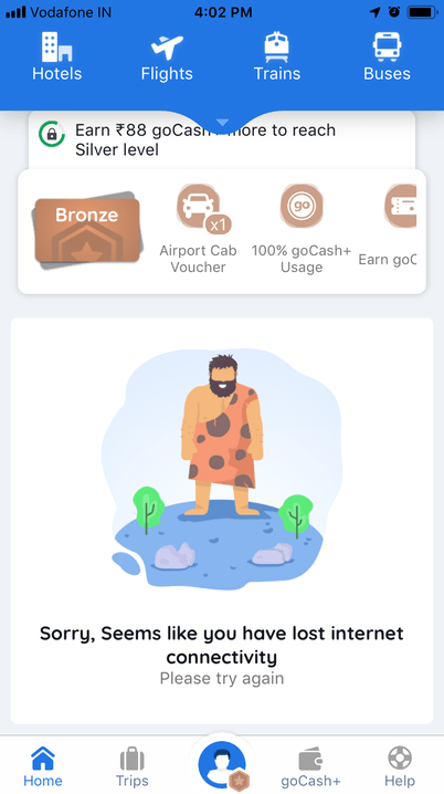
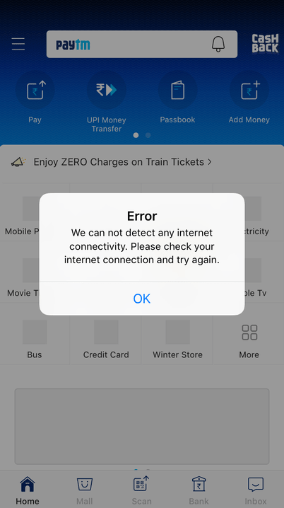
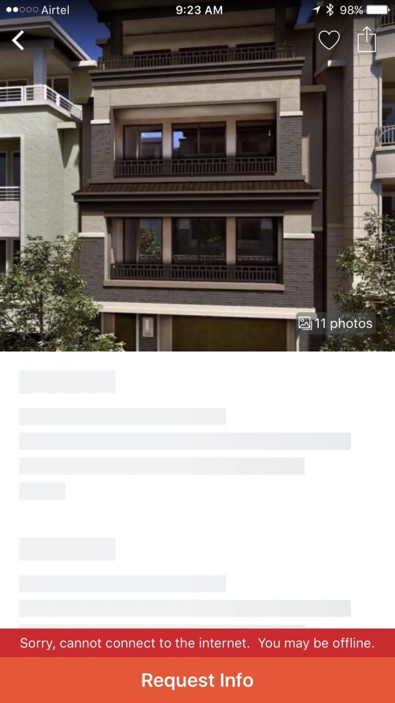
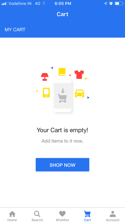
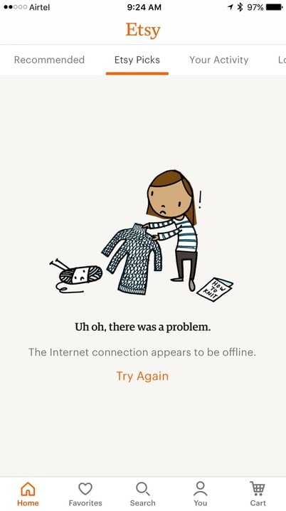
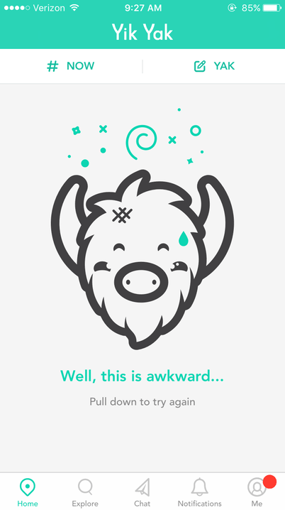
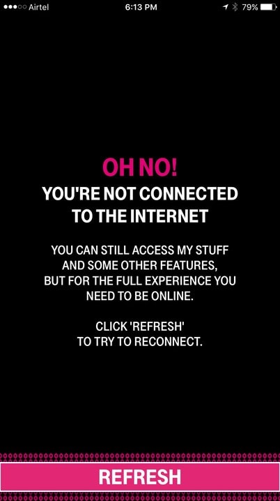
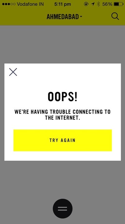
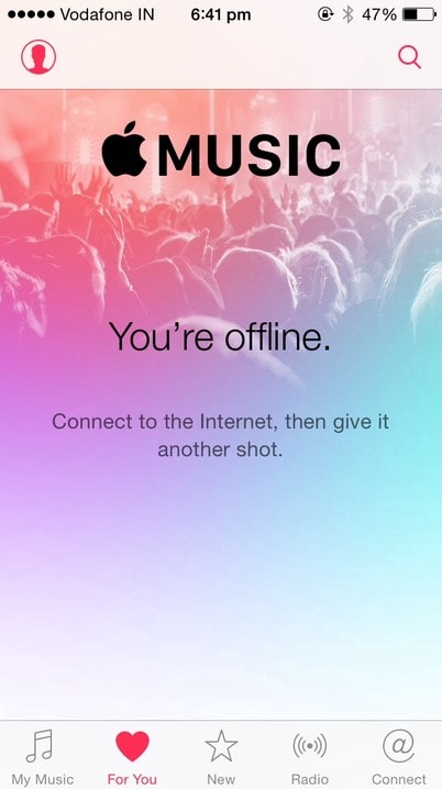
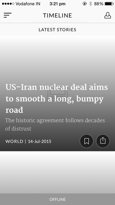
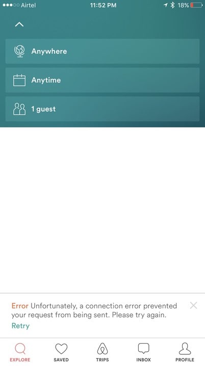
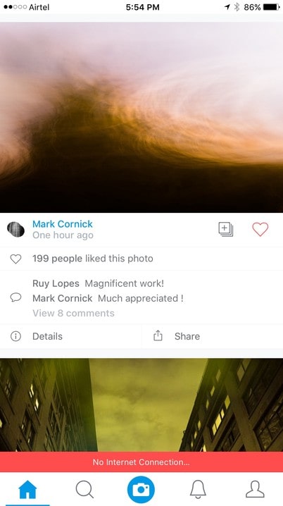
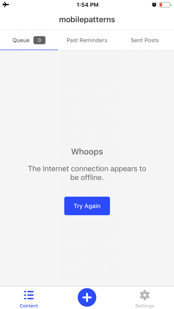
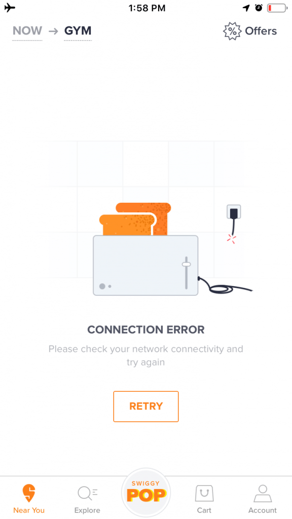
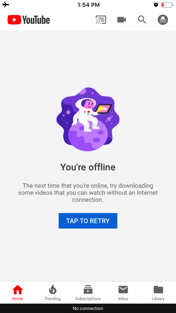
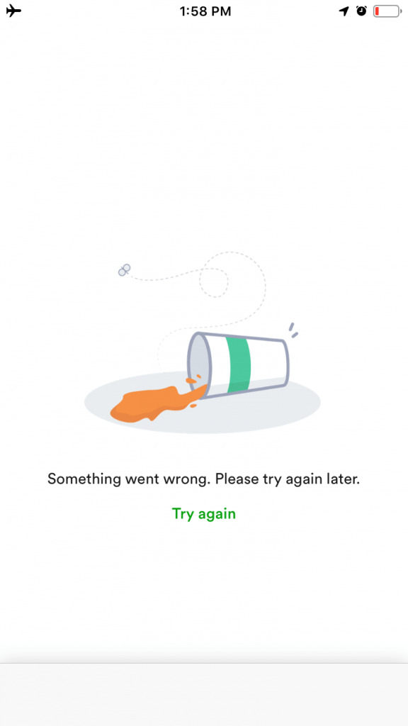
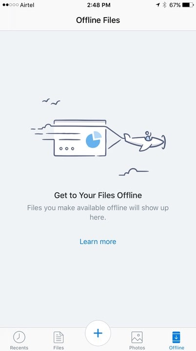
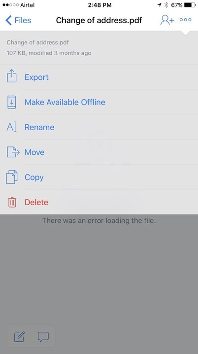
Use your empty states to handle network unavailability notifications
If your app doesn’t have any cached data and has nothing to display, you need to design an “empty state”. In such cases, you want to clearly let users know about the problem and what the next steps are for them.
In these examples, you can see how these apps use clear messaging when needed to let users know about the network status. They also give a button so that users can easily tap on it and retry again.

3) Let users interact with their content by making content offline ready
Making your mobile app work offline means that you try to provide, as much as possible, the consistent user experience whatever the network condition is: up, down or even slow or inconsistent in speed. This is the most important experience you’ll need in order to provide a seamless offline-first experience.

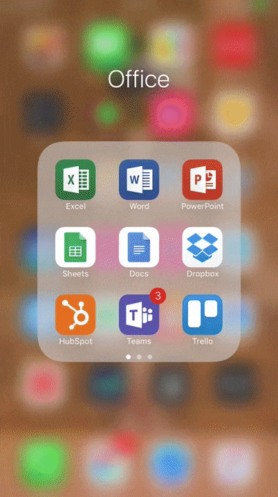
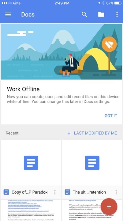
Beyond caching, there are apps that absolutely need to work offline in order for users to get the most out of them. Examples of such apps are Trello, Evernote, Google Docs, and Dropbox, and Spotify.
4) Allow users to finish critical tasks in all network conditions
Being disconnected, even momentarily, can be a brutally frustrating experience for someone who is attempting to get things done. The key to making offline experiences consistent is to allow users to finish their tasks offline.
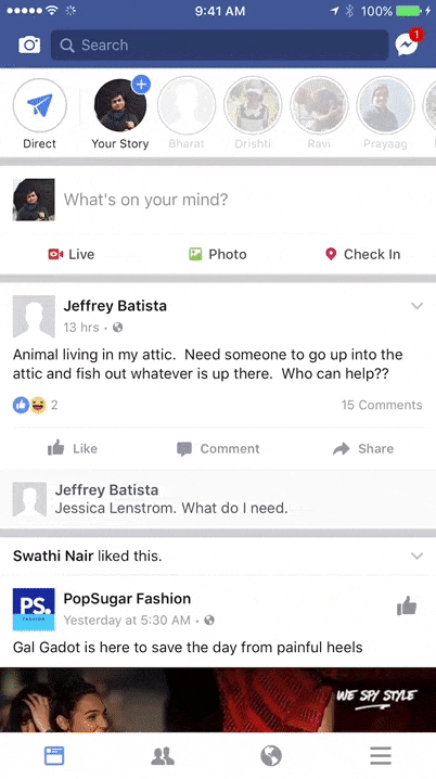
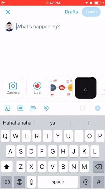
Here is how Facebook does it. We like how Twitter reinitiates the process automatically even after you restart the app.

When the user is away, you can use notifications to remind them to get back to their critical tasks.
Let’s use Amazon as an example. If you’re busy placing an order and your network goes out, what can you do? Here are some design ideas to avoid simply showing an error message:
- Cache data
- Show the disconnected state and show last 10 visited products on the home screen
- Allow the user to add products to cart
- Notify the user that prices may change once connectivity has been reestablished

Conclusion
Offline glitches can ruin every seamless mobile app launch experience. However, some of the most incredible offline experiences are actually just letting users know that the problem will be taken care of for them. What better way to handle lost progress than to just let the user know “We’ll take it from here”?
Once again, keeping offline experiences in mind is crucial to achieving consistency in your experiences and assuring users in all situations.
When you use these best practices, your app will perform as expected and will not throw any surprises. When the app is designed for offline experiences, it suddenly becomes faster because the app isn’t waiting to download more data or information.
Do’s and Don’ts of designing a Disconnected Screen:
DON’T:
- Show raw error messages
- Use technical jargon
- Just say “disconnected”
- Get in the user’s way
DO:
- Provide the app offline by default if your app doesn’t require much data.
- Educate users about how they can download resources for offline use.
- Cache first to provide a better experience
- Make your state notifications informative and consistent
- Let users finish what they started
- Remember what users were doing last
- Assure them that their progress or action will not be forgotten or deleted
Did we forget something? Got another UX tip to share with us? Add a comment with your suggestions for our readers.
Mobile Patterns is an inspiration gallery made with love for designers by designer. Besides creating and curating designs, we love sharing insights on classic as well as latest designs. Stay updated with tips, best practices, and design inspiration in vogue, hit the follow button.