Everything has its beginning. First time unpacking a new Apple product or the first time launching your brand new PS5 – all these experiences bring an unmatched first impression, which stays in a users’ mind and on the tips of his/her fingers. The skill of making a striking first impression is an art indeed, where impeccable user experience is the key.
UX workflow also has its “first date” with a customer. Moreover, the first time using the UX flow may define whether the user will stay with your app for a long while, or the interaction drops. As sadly as it sounds, this is a frequent case: about 79% of the users abandon the app within five to seven days of using it.
This article will hit on the available types of UX onboarding screens, how you can measure the efficacy of this instrument and which tips can help you in building a one-of-a-king onboarding experience.
What are the types of UX onboarding screens?
The term “onboarding” is widely renowned in the HR domain, where it embraces the activities, policies, and techniques aimed at engaging and guiding a newcomer into the company’s routine.
As for UX design, onboarding assumes the meaning of a “message in a bottle” designers send to the user. In other words, it resembles a “delayed conversation” between a user and the app developers. The type of onboarding screens you build depends on what kind of message you want to “put in the bottle” and have delivered to the user.
Thus, there is an abundance of onboarding screen types that vary depending on the purpose they perform. We have boiled them down to these three categories:
- Upfront
- Progressive
- In-app assistants
Let us dive into the details of each one.
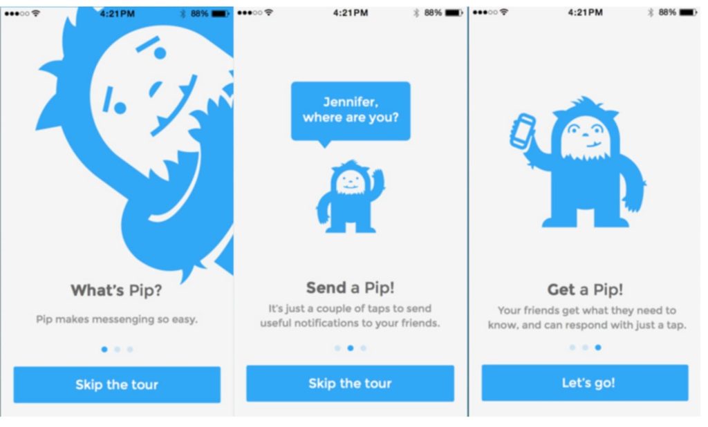
Upfront onboarding screens
Upfront onboarding screens usually take the form of shifting slides and typically have no relation to guidance.
As Nielsen Norman Group research suggests, upfront screens are only useful when built for marketing purposes. Using them to guide and teach users through the app interface proved ineffective.
Take a look at the example below.
Another great benefit-oriented onboarding example gives Trip.com. It clearly communicates the benefits of their app in the headlines.
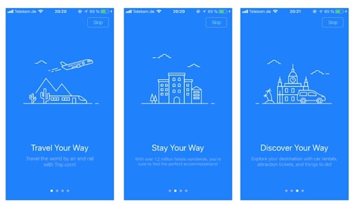
A mistake, sometimes made by designers, is trying to insert tooltips and user hints in the slide carousel. In reality, you cannot expect a user to explore so much information at once and memorize everything. The truth is users do not download an app to see how it works. Instead, they are more interested in the value the app adds to their lives. So use the first meeting with the user to tell about the values and benefits your app brings to their lives.
Progressive onboarding screens
Unlike the previous type, progressive screens aim to guide a user through the first stages of using an app. As a guide, such screens usually involve specifically focused tips, and sometimes animations.
This guide usually incites the user to take specific actions to understand better how the app works. The only thing is that these step-by-step models are one-time experiences, meaning a user cannot go back to complete them again. In some cases though, designers create a “Start the tour again” button. Although it can help users to better handle the app navigation, yet it does not solve the issue essentially.
Also called in-context tooltips, these screens help users explore the product, explaining how to use certain features and unveil their value.
A vivid example of progressive onboarding screens is the one, designed by Evernote – the widely known app for managing notes.
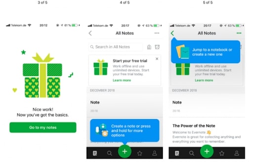
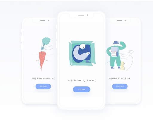
Success and null state UI
You can help the user experience very much by using so-called success states (for example introducing sharing on the first success post) and empty and null states (show arrows, text explanations).
This tool implies that when a user fails to complete some action or gets to some empty box, the app communicates this to the user. This message may sound like “Seems like the list of notes is empty. Create a new list now”. This way, even when the user did not have successful action, you do not leave him alone with that, but give him a tip on what to do next. Here’s an example:
Assistant onboardings
The UX onboarding process goes beyond step-by-step tips and carousel slides. It may also involve third-party integrations like chatbots, customer support pop-up icons. This type of interaction enriches the user experience with the following benefits:
- Engagement
- Imitation of interaction with a real person
- Systematization of the information a user gets
- Capacity to get back to the assistant at any time
4 tips to have in mind when building onboarding screens
Based on Uptech experience, we have crystallized some rules to follow while creating UX onboarding screens. Here they are:
Know your audience
Some may mistakenly think that creating UX onboarding screens does not require market research. In reality, market investigation and user interviews are essential, and here is why.
Whatever type of UX onboarding screen you design, you pursue a single purpose – making a user stay with your app for as long as possible. This means you have just several minutes to clear things up to the user and make him fall in love with the app. Nothing can help with that better than knowing your user’s pains, wants, and needs.
Keep it simple
This one applies to any onboarding type you make. Simplicity is the answer. This means your animations, texts, tooltips – all of these should be clear, concise, and engaging. Do not go to great lengths, explaining to the user where to go and what to do. Remember that you are not trying to be a parent to the user, but rather become her/his friend. So do not overcomplicate your onboarding with the riles, tips, and instructions.
Make a story
Your guidance should not come from anywhere and unravel aimlessly. Your onboarding flow will hit the spot when you put it into an interactive story with an engaging start and satisfying finish. In other words, the user should feel convinced that she/he needs some guidance, only to get a reward at the end in the form of being all ready and equipped to use the app.
Do not expect too much from user
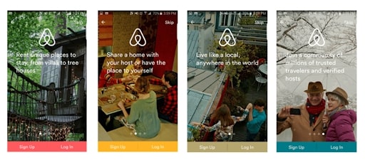
In the fast-paced stream of life, an average user cannot take a long while to dive deep into the details. So try to keep it one screen per function or one benefit at a slide. This simple rule makes it easier for the user to absorb the information and read your message through. Here is how simply and fluently Airbnb infused it in its onboarding screens:
YouTube also keeps it one-at-a-time tips in its app for Android. The app narrows down the instructions and draws the user’s attention to a single action. Instructional overlays are still present to guide a user through an unfamiliar interaction. Yet, these tips appear one at a time on the launch page when a user visits a new section of the app.
How to use onboarding screens in testing the UX flow?
Usability testings are an inevitable part of UX design creation. Here’s how to test your UX design for high usability.
The rule of thumb is your UX onboarding is successful, when users, who have not completed the guide, perform worse than those who have. Thus, by testing you need to figure out whether an onboarding guide is actually necessary in your case.
To figure this out, you need to test the UX flow with both – users who have done onboarding and those who have not. So here we go.
Testing marketing onboarding screens
To see if your onboarding slides strike a chord with users, this scenario may help:
- Make a 5-second “first impression” onboarding;
- Prepare a short survey for users for a detailed feedback;
- Use any other test format that suits your needs (interviews, rate bars, etc.)
Testing the UX functionality
To measure how adequate the user flow is, we recommend using the first-click test. The first click test helps determine how easy and fast it is for users to complete a given task. For example, the user is tasked to make an order on a website template. These tests can be also run on wireframes, screenshots, sketches, etc. The whole testing experience is recorded, and follow-up questions can be asked for more information.
Drawing up
UX onboarding screens is a tool you can use for a variety of purposes. You can use it to tell him/her about your app’s benefits, unveil the product’s value, and even test the UX flow for discoverability and findability.
Yet, the primary purpose of your onboarding is to make your user stay with you for a long time. To make it work, your onboarding flow needs to be simple, concise, and eye-catching. Only in this case you will turn a random user into a faithful customer.

Dmytro Domashenko
Dmytro Domashenko is a Lead UX/UI Designer at Uptech with 5-year background in building design for mobile and web apps. Dmytro emphasizes usability testing and user research in his work and eagerly shares his experience in articles, workshops, and lectures.